The Kresvik mark, and how to use it.
One mark at every size: the solid K with the Signal Blue tip breaking away from its shoulder. It is 1.157:1, never square, and it holds down to 16px. There is no second drawing for small sizes and none is needed.
The mark
Four files, two decisions: which ground it sits on, and whether the accent is available. Deep Navy on light, white on Basalt or Signal Blue. The tip is Signal Blue wherever colour is available at all.
Clear space and minimum size
Clear space is the width of the K's stem - 16% of the mark's width - on every side. Nothing enters it. The mark is never smaller than 16px tall; the lockup never smaller than 24px, and it needs about 20 units of air on its right because the tip overhangs.
Colour
Six, and that is the whole palette.
- Basalt
#071228the one dark surface - Deep Navy
#0A1B3Dstructure on light grounds - Signal Blue
#2E6BFFthe accent, and the breakaway tip - Steam
#6FA0FFSignal Blue lifted, for dark grounds - Mist
#F4F7FBthe paper - Slate
#44506Bbody text
Typography
Sora for display and the wordmark, SemiBold. Spline Sans Mono for readouts, labels and anything that should read as an instrument. Both are OFL and both ship with the site - nothing is fetched from anyone else.
Sora SemiBold
SPLINE SANS MONO 500
Tiles
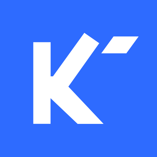
One treatment: Signal Blue ground, mark in a single white ink, at 58% of the tile height and optically centred rather than bbox centred - the ink sits at 32% of the bounding width because the tip is small and far right. Signal Blue is the only ground that holds everywhere a tile lands. A Basalt tile has no edge against dark browser chrome and dissolves into it; a Mist tile does the same on a light one. The tip is white rather than a tint because at 16px a tint reads as a missing tip.
LinkedIn is the exception: Basalt ground, Signal Blue tip. It is the one tile that never lands on browser chrome - it sits in a fixed white card on the profile, where Basalt reads as deliberate, and it is big enough there for the tip to hold its own colour.
Rounded where the platform does not round for you, full bleed where it does. A pre-rounded tile handed to a platform that rounds it again reads as a shrunken square inside a ring.



Don'ts
- Do not redraw the mark, or make a second version for small sizes.
- Do not tint the tip on a Signal Blue ground - the whole mark goes white there, tip included.
- Do not stretch it. It is 1.157:1 and never square.
- Do not put a lockup in a tile. Tiles take the mark alone.
- Do not let anything into the clear space, including the edge of its own tile.
Files
SVG throughout. The wordmark, both lockups and the banner carry live text in Sora - install the font or convert to outlines before print.
- Mark, colour, light ground
kresvik-mark-color-light.svg - Mark, colour, dark ground
kresvik-mark-color-dark.svg - Mark, one ink, navy
kresvik-mark-mono-navy.svg - Mark, one ink, white
kresvik-mark-mono-white.svg - Wordmark
kresvik-wordmark.svg - Lockup, light ground
kresvik-lockup-light.svg - Lockup, dark ground
kresvik-lockup-dark.svg - App icon
kresvik-app-icon.svg - Favicon
kresvik-favicon.svg - Avatar, full bleed
kresvik-avatar-blue.svg - LinkedIn logo
kresvik-linkedin-logo.svg - LinkedIn banner, 1128x191
kresvik-linkedin-banner.svg








Mark v2026-08-11.